
This is where you can view, explore, and interact with GDQS data for more than 20 countries across different regions of the world.
Today, our global food system is under tremendous pressure. We are at a turning point where system-wide failures need to be challenged and solutions need to be scaled. Robust and up-to-date dietary data at the population level equip country actors to design, monitor, and evaluate evidence-based policies and programs. So often, regular data on diet quality are not available, yet we must understand what people eat to make progress towards achieving healthy diets. The Global Diet Quality Score (GDQS) metric and the GDQS app were created in response to this urgent need.
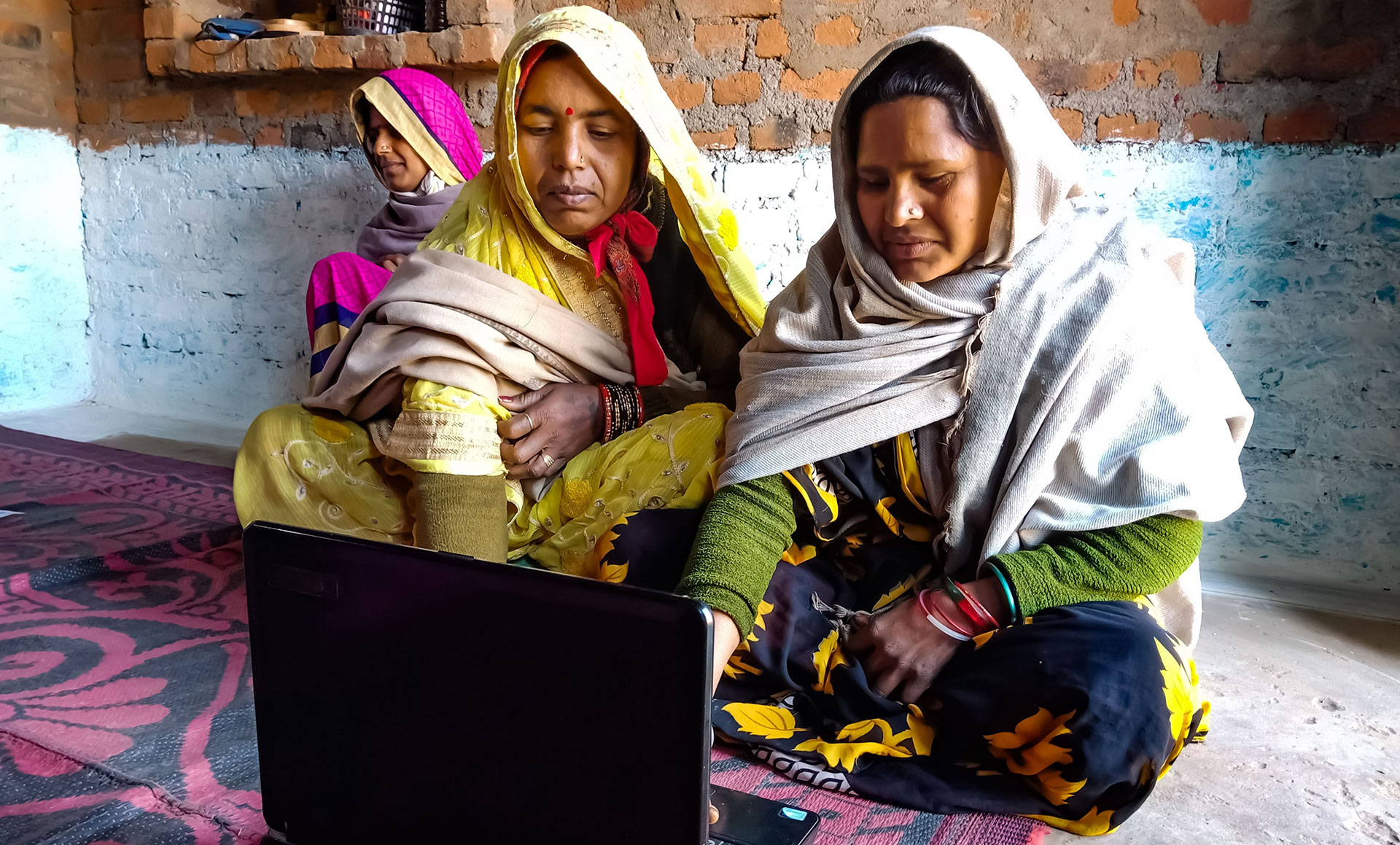
The GDQS is the first diet quality metric validated for global use and designed to reflect overall diet quality. The GDQS can be tabulated with quantitative 24-hour dietary recall data. But because quantitative 24-hour dietary recall surveys are often time and resource prohibitive, Intake has also developed a technology assisted data collection tool – the GDQS app – to provide a streamlined, low-cost, easy method to collect data on the GDQS.
The set of GDQS data visualizations below provide an opportunity to see the types of questions that can be answered when data are collected with the GDQS app.
On This Page:
GDQS Visualizations
Continue scrolling to learn more.
-
About the Data
The data sets used to produce these GDQS visualizations come from a total of 23 countries across all world regions. The data sets vary in terms of year of data collection, geographic coverage of the data (national or sub-national), sample size, and the age and sex of respondents for which data are available. Additional details on the data sources used along with a description of the methods used for tabulating the GDQS data are available here.
Note: All GDQS data visualizations below reflect analyses for respondents 15 years and older; and data for both men and women, to the extent possible. When data on both men and women are not available in a country data set, data for women are presented for that data set in the default “all” visualization view.
Learn More
-

About the GDQS
The GDQS incorporates dimensions of both nutrient adequacy and dietary risk factors associated with non-communicable disease risk in its design and scoring method. This unique design of the metric provides the necessary framework to effectively assess, monitor, and evaluate population-level progress in achieving healthy diets.
The GDQS metric has a possible range of 0-49. Cut-offs have been established to allow for using the GDQS to identify the percent at high risk for poor diet quality outcomes (using a GDQS cut-off less than 15) and the percent at low risk for poor diet quality outcomes (using a GDQS cut-off of 23 and higher).
With GDQS data, we can explore what is causing the high percent at risk for poor diet quality outcomes in some country data sets and why some country data sets show a low percent at risk for poor diet quality outcomes. This will be explored in later visualizations. First, let’s take a closer look at the GDQS data for Brazil and India to explore how the percent at high risk and the percent at low risk for poor diet quality outcomes varies across geographic regions within each country.
-
Understanding the GDQS Score
To understand the overall score for the GDQS, it is important to examine the components driving the score. The first step is to examine the score for the GDQS positive metric and the score for the GDQS negative metric.
The overall score for the GDQS metric is the sum of the GDQS positive metric and the GDQS negative metric. The contribution of the GDQS positive metric to the overall score for the GDQS indicates the extent of healthy food group consumption. The contribution of the GDQS negative metric to the overall score for the GDQS indicates the extent to which unhealthy food groups have not been consumed.
-

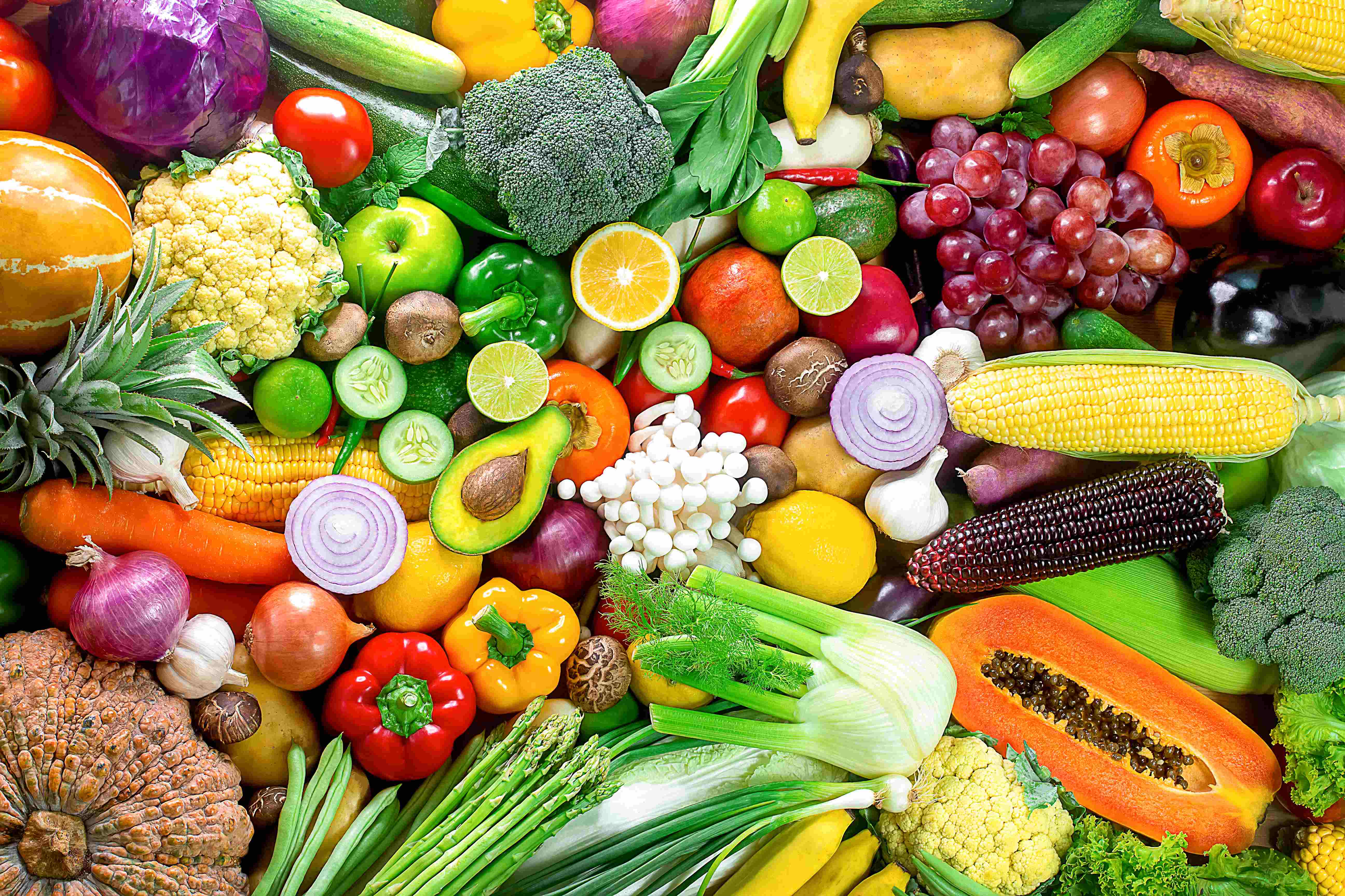
GDQS Points by Food Group
The GDQS comprises 25 food groups: 16 healthy food groups, 7 unhealthy food groups and 2 food groups that are unhealthy when consumed in excessive amounts. Points are awarded for each food group based on whether the food group is healthy, unhealthy, or unhealthy when consumed in excessive amounts; and based on the amount reported as consumed for each food group. Details on the GDQS metric scoring system are available here.
-
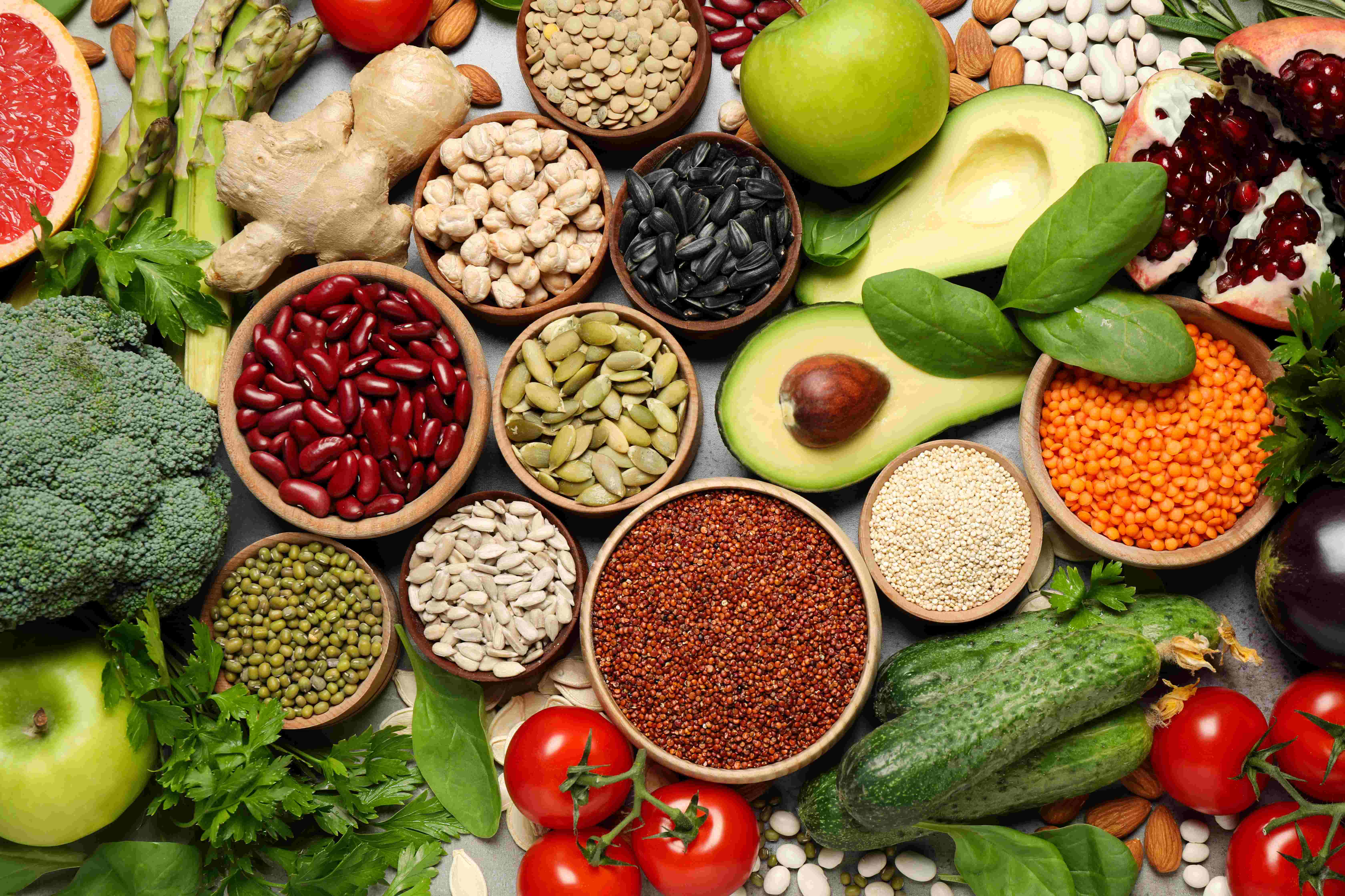
Amounts Consumed by Food Group
Information about the amount of healthy and unhealthy food groups consumed is critical to understanding of whether a diet poses risks for nutrient inadequacy or non-communicable diseases. With the GDQS app, data are collected on the amount of each food group consumed, to classify the amount consumed as low, medium, high, or very high for each food group. These data are essential to the interpretation of dietary data, and to the identification of specific dietary patterns that may require programmatic or policy intervention.
-

Foods and Beverages Consumed
Detailed information about the foods and beverages consumed provides essential data to help guide food, nutrition, and agriculture programming and policy decisions. These detailed data are collected and made available for further analyses when data are collected using the GDQS app. The figures below are just one example of how these data can be visualized, to allow for easy identification of the healthy and unhealthy foods and beverages that are commonly consumed.
The GDQS app was developed to provide a method to achieve what has today become an urgent imperative to measure diet quality globally.
The GDQS app provides a streamlined method for policy makers, program designers, researchers, and others to understand what people eat, to help inform evidenced-based program and policy design in a context where diets everywhere are changing rapidly and the need to achieve healthy diets is crucial to ensure good health for all. The set of GDQS visualizations above are only a sample of the type of analyses that can be carried out with GDQS data.
Effective use of GDQS data by country actors has the potential to catalyze evidence-based policies that can be used to spearhead health, economic, and social action to advance the possibility of making healthy diets achievable for all.